New Entry

Module 14

What did you complete this week?

This week, I worked on completing my Final Presentation. To finish the presentation, I made changes to the clickable prototype based off of the testing reports. Final Presentation

What will you complete next week?

Next week, if there are any adjustments to my POC, I will make the corrections.

Any feedback from instructor or peers last week?

Create Before & After slides for presentation.

Past Entries

Module 13

What did you complete this week?

This week, I tested my clickable prototype and with alert in Adobe XD. I tested on 5 different people within my target audience and recorded 4 out of the 5 because the 5th person said what the others commented on during the testing. I had the testers choose any three use cases of five with one tester abitiously testing 4 use cases. Before testing, I advised the testers that they couldn’t physically type into the text boxes and should pretend that they were typing and imagining their map layout. Here are the results: PDF. I also showed them all the possible ways to achieve the goal through the prototype, but here is a pdf of the tasks.

What will you complete next week?

Next week, I will update my POC with the results from the prototype testing. I will also do my Final Presentation.

Any feedback from instructor or peers last week?

Consistency of type, color, sizes in prototype.

Module 12

What did you complete this week?

This week, I created a clickable prototype in Adobe XD. I am still working on that actual prototype/project in Ionic, but it didn’t reflect the visual design of my ui style guide yet. If you do want to test the project prototype, here is the link: Ionic Prototype.
You will need to enter in a password to test it: AAUTester

Also, the AAU LMS server crashed around 10 pm Pacific Time and I couldn’t upload so here is what I wrote in the discussion:

The Kitchn is a website food magazine with daily articles about kitchen wares, cooking, and recipes. The main page is a 3-column grid with full width callouts and videos. The website uses a contrast of black text on a white background with high saturated photos and other bright food colors. The color palette is white, black, red links and icons and a touch of yellow that matches their logo. The website as a 3 column grid works well. The full width callouts could be combined into a carousel as I can miss some of the other callouts because they are too far at the bottom.

What will you complete next week?

User Testing with the clickable prototype with 5 users in target audience range, provide tasks and documentation.

Any feedback from instructor or peers last week?

Add icons to nav buttons, fix some crime icons to match the rest.

Module 11

What did you complete this week?

This week, I revised my wireframes for a user experience testing. Last week, I wanted to test as a user experience testing, but it ended up being a visual design testing. This week, to avoid confusion between last week’s test, I presented the prototype in grayscale. Here is the feedback. I was only able to do 2 user testing this week.

From last week’s testing comments, I updated the Proof of Concept to reflect the style changes. I also added ui elements from my style guide to the wireframes.

What will you complete next week?

I feel that I have finally caught up with my timeline. Next week, I will have my clickable prototype. It will be done in Ionic, which I am working on in the GDS 820 class. If I finish every page, I will perform another user test with the clickable prototype.

Any feedback from instructor or peers last week?

Redo the paper prototype as a user experience testing.

Module 10

What did you complete this week?

This week, I conducted the paper prototype and made adjustments to my wireframes and added them to the Proof of Concept. Based on my timeline, I am only a week behind, which I should be able to catch up next week due to the Thanksgiving break. Paper Prototype Feedback | Proof of Concept

What will you complete next week?

Next week, I will catch up due to Thanksgiving break. I need to refine my UI style guide.

Any feedback from instructor or peers last week?

Refine style guide.

Module 9

What did you complete this week?

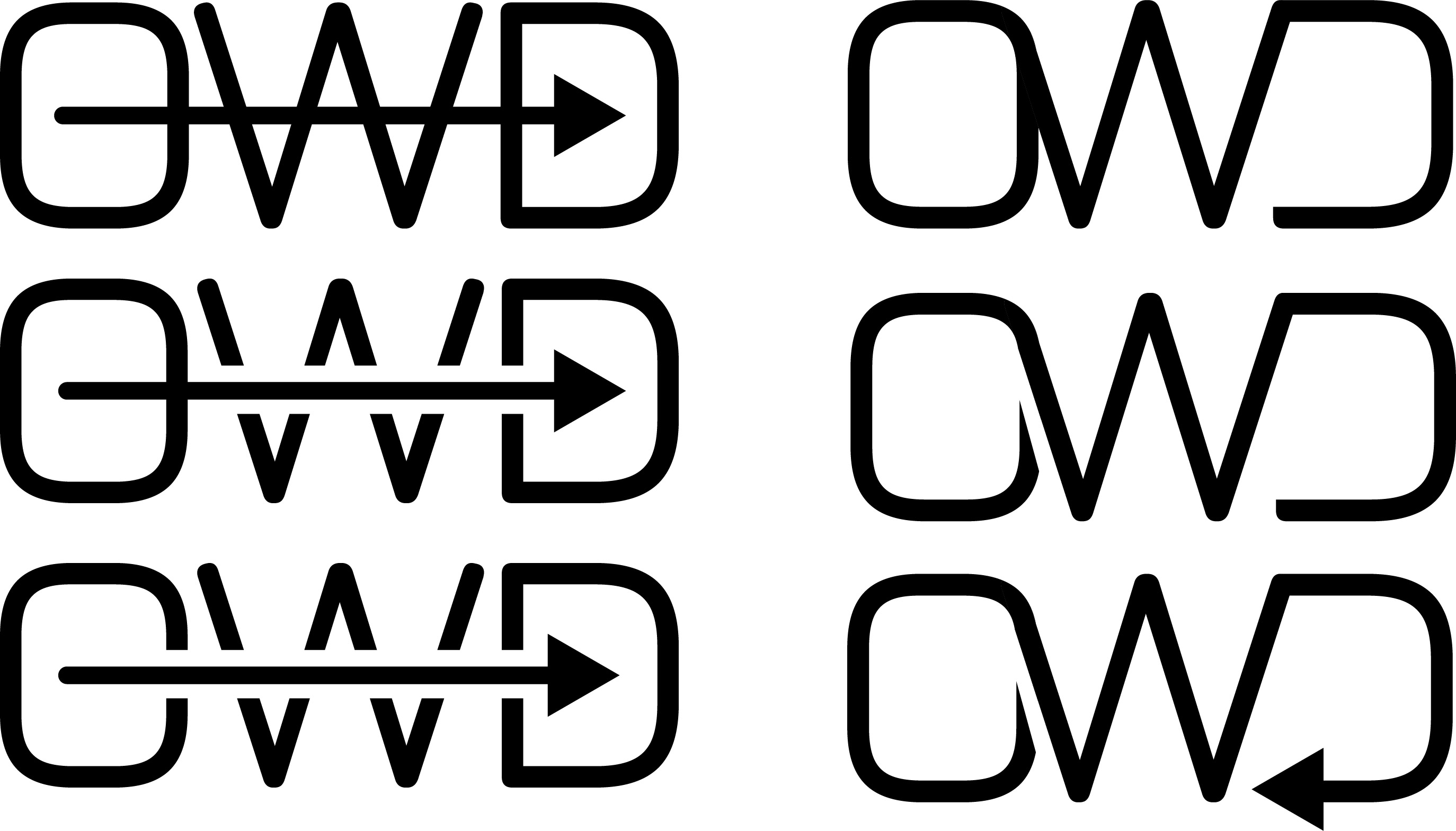
This week, I finalized my logo and tagline without doing another survey. I chose the tagline from one of the suggestions. One of the taglines that I wanted to use was Wander Wisely, but after doing some research, I found that the phrase was already being used by Travelocity and I didn’t want my project to be confused with the travel booking website. I also completed the UI style guide this week.

UI Style Guide
What will you complete next week?

Next week, I will continue working on the style guide. I will also do a paper prototype testing.

Any feedback from instructor or peers last week?

Start on ui style guide and finalize logo/taglines.

Module 8

What did you complete this week?

This week, I edited the previous tagline survey and sent it out to my co-workers and so far I’ve received 22 responses. I also sent them the color logo survey. Based off the new surveys, Best Way Forward and Wander Wisely are the top two taglines. For the color logo, option 8 happened to become the best logo choice. I read one of the logo responses to flip the colors as red is a symbol of danger and green is safe. Tagline Responses and Color Logo Responses

What will you complete next week?

Next week, I will send a new survey based on the top answers and create a new logo with tagline survey. I will also do a paper prototype test with the current user personas from my POC.

Any feedback from instructor or peers last week?

From the feedback of the midterm presentation, I need to include everything as it better shows the process of how things were created in the project.

Module 7

What did you complete this week?

This week, I worked mainly of the Midterm Presentation. I needed to update my information architecture, create a non-clickable wireframe, and update my proof of concept with the new low-fidelity wireframes. The good thing that helped save some time was that I already had an updated proof of concept from the WNM 810: User Experience class so I could transfer the user tasks over to the new proof of concept and change the wireframes. Here are the links to the Midterm Presentation and Proof of Concept.

What will you complete next week?

Next week, I will include more survey responses for the tagline. I am also going to update the survey with the suggestions that I already received. From my timeline, I will also update the POC based on the feedback.

Any feedback from instructor or peers last week?

From the feedback, I need more survey responses for the tagline and logo with tagline. Because of the midterm I will show the responses next week.

Module 6

What did you complete this week?

This week, I published two surveys: Logo Color Palette and Tagline Survey. From the responses, I’ve narrowed my tagline to “Best Way Forward” and finalized my logo. I also updated my wireframe/prototype from the 810 class last semester to reflect the current moodboard. The map with the markers are from last semester’s 820 class, which I am retaking this semester and changing the mapping platform to OpenStreetMap. The change to the new map system is because Google now requires a fee to use Google Maps Javascript API. Here are the links to the tagline survey responses, the color logo reponses, and the wireframe. You can also find the link to the logo with tagline survey here.

Final Logo
What will you complete next week?

Next week, according to my timeline, I will have completed all tasks wireframes. I also plan to redo some of the pages to fit a better grid layout. Once I get freedback from the tagline logo survey, I can also create branding guidelines for the logo.

Any feedback from instructor or peers last week?

I got more feedback during this current week than from last week. Last week, I was behind on my schedule and I think I got caught up this week. The survey responses proved to be helpful in deciding the direction of the new name.

Module 5

What did you complete this week?

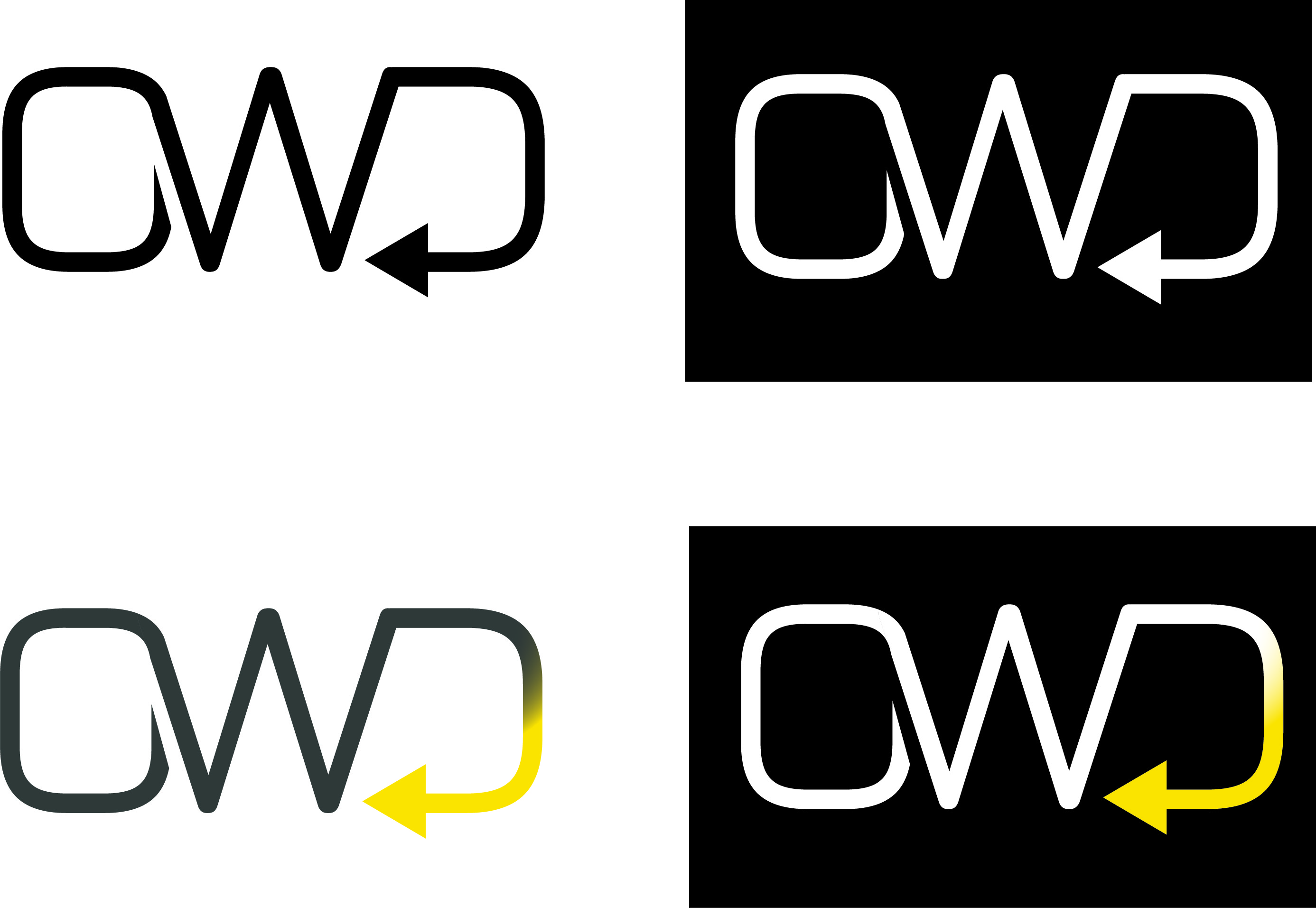
This week, I finalized my moodboard & black and white logo based on critiques and in-person surveys:

Final Moodboard
Final Logo

I was a bit busier than usual (job-wise) this week so I couldn’t complete every survey and design that I wanted to. Here is the tagline survey: link. Logo Survey Here.

What will you complete next week?

Next week, according to my timeline, I will have finalized the color logo. I didn’t have time to start wireframes this week so I will start on it next week.

Any feedback from instructor or peers last week?

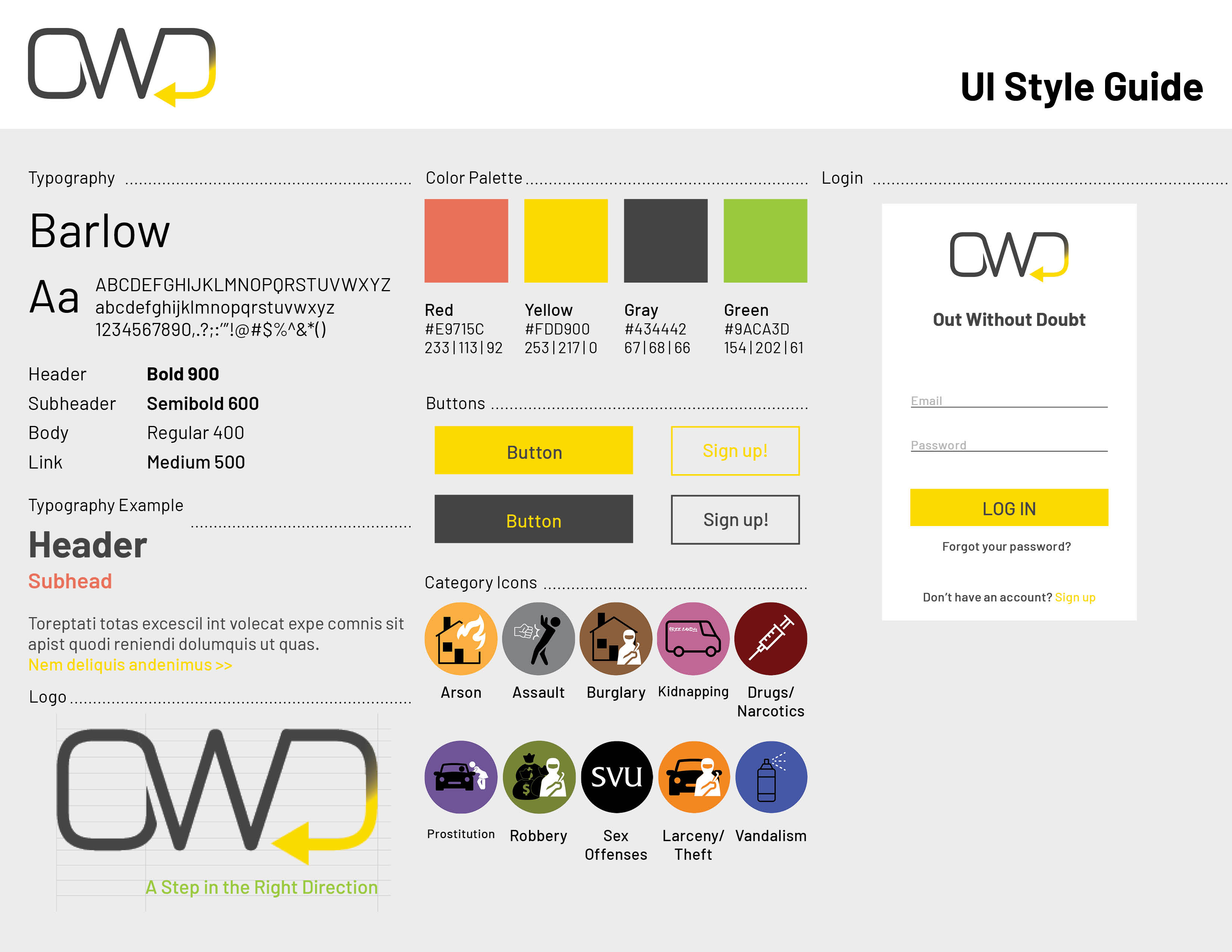
Based on the feedback last week, most people liked the logos on the right side, the continuous line logo. From feedback I received while doing the in-person review of the logo on the bottom left, the "O" with the arrow through it made it look like the letter "G". The chosen moodboard also had the most color options and icons that would guide me in the best direction.

Module 4

What did you complete this week?

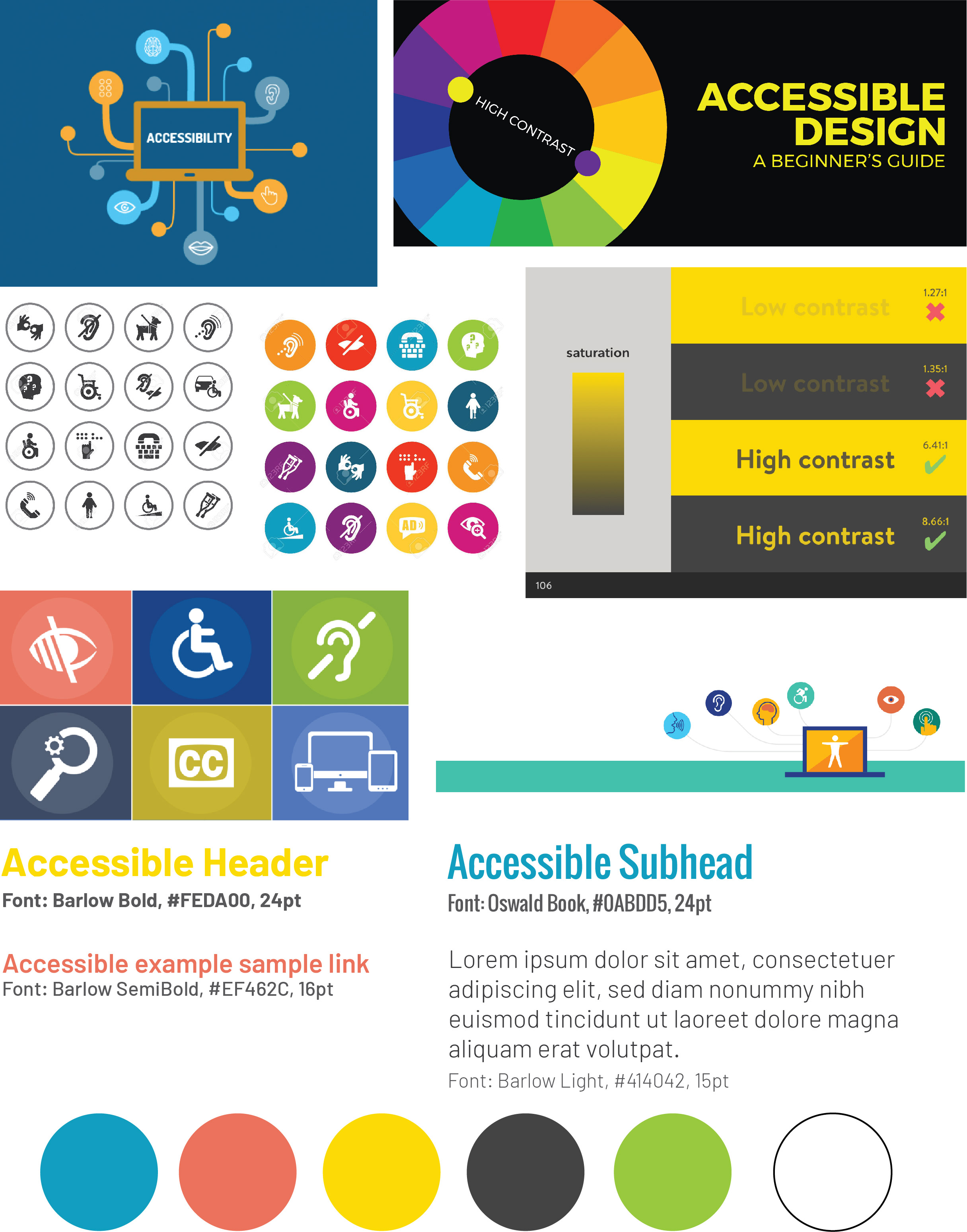
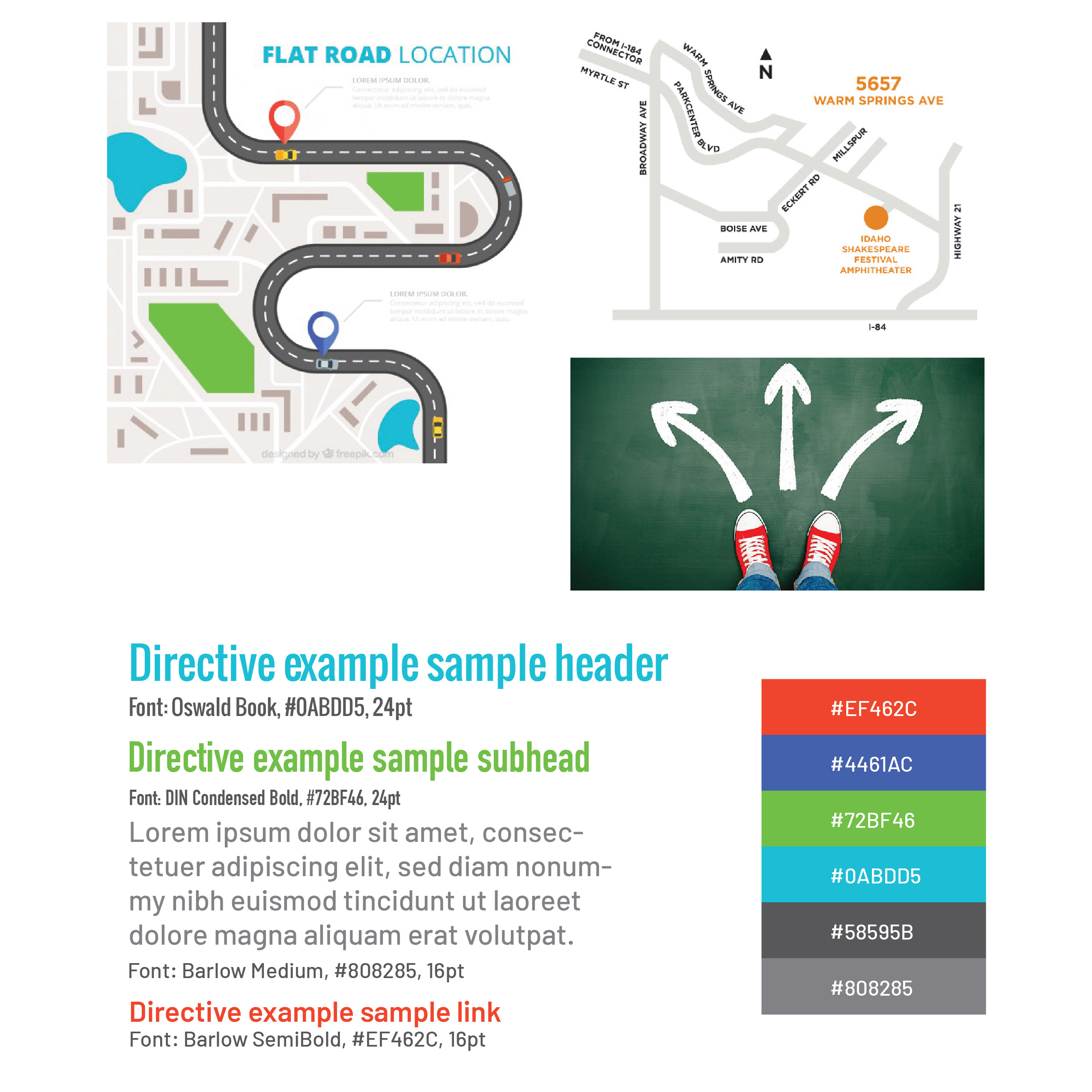
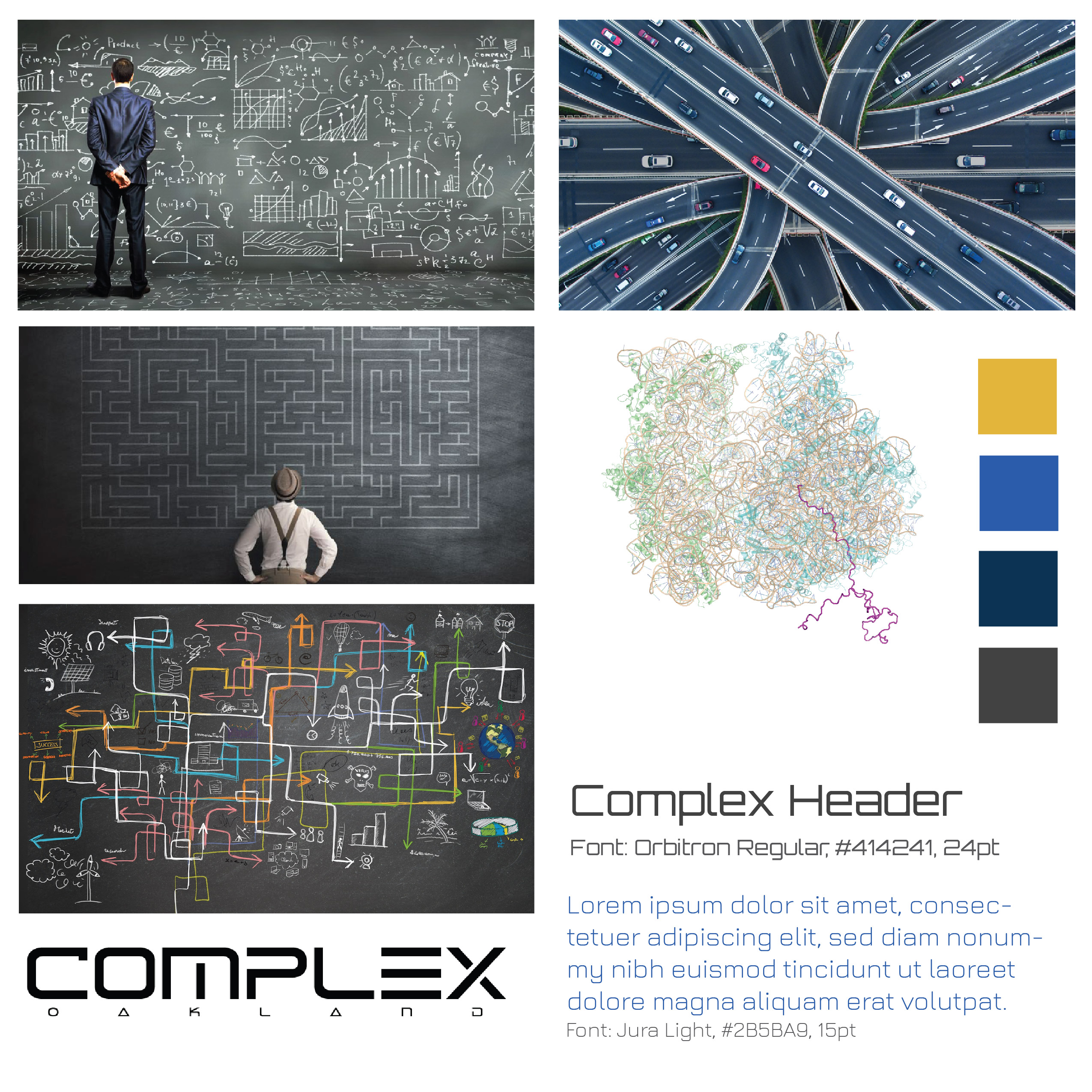
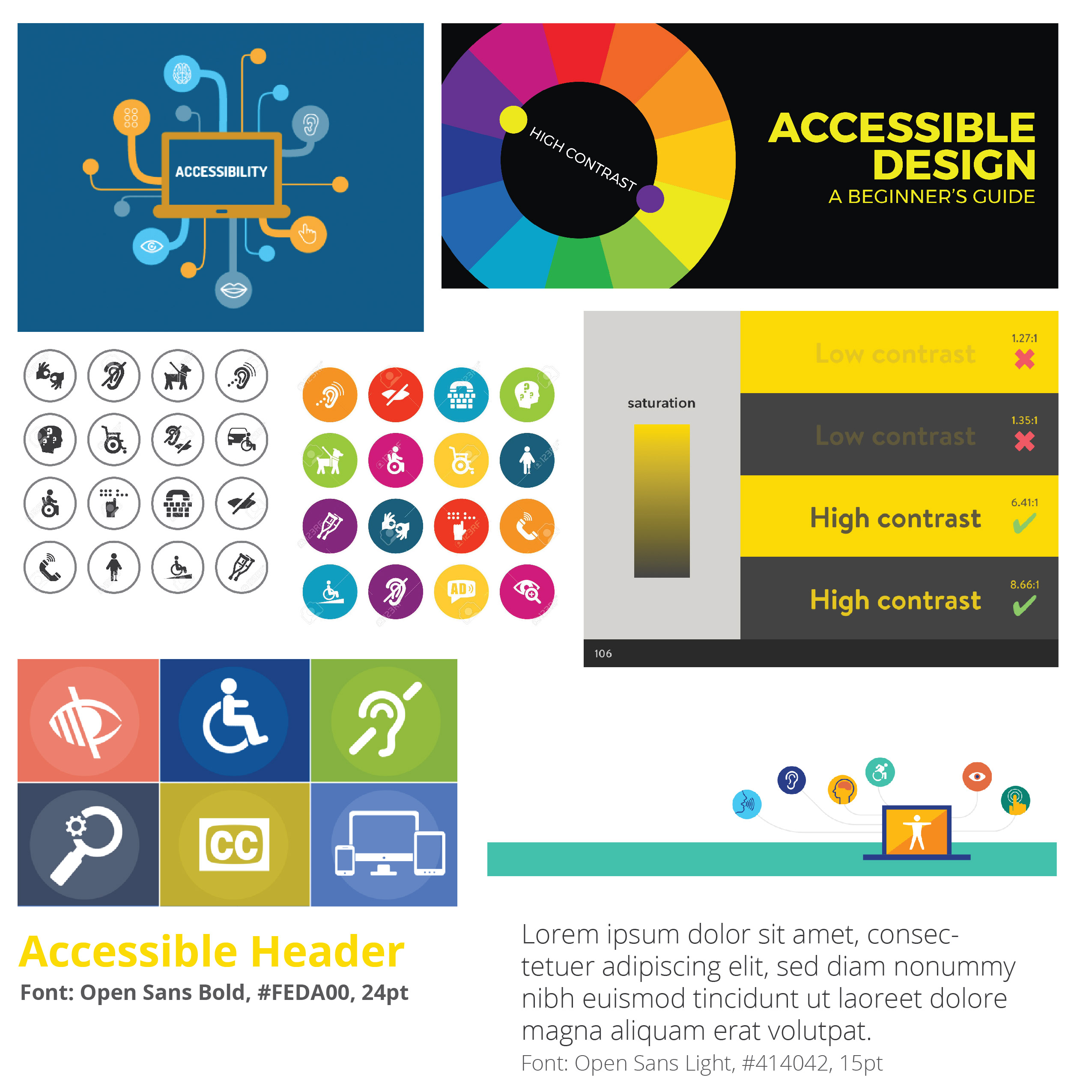
This week, I created 3 different moodboards based on 3 different keywords: Directive, Complex and Accessible.

Directive Moodboard
Complex Moodboard
Accessible Moodboard

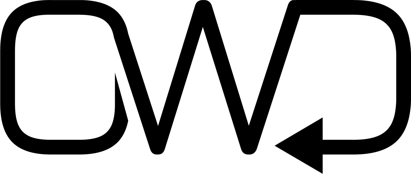
I also made some revisions to the logo. I am going with the simple initials of OWD for Out Without Doubt. I currently like the last one with the arrow as the ending of the "D" line.

OWD Logo Revisions
What will you complete next week?

Next week, according to my timeline, I will pick a moodboard as my final and also pick my final logo. I didn’t get to do the survey this week, so I will do it for this upcoming week. This will allow me to get more feedback for both the logo and moodboard.

Any feedback from instructor or peers last week?

Based on the feedback last week, every logo except for the initial one was too complex for my project. There are many possiblities for initial logos, which I started this week. Now that I have worked only on creating different versions of the initial logo, I see now that the other logos would have caused problems with scaling.
Module 3

What did you complete this week?

My new name for my project is Out Without Doubt. This week, I created 5 different logos. Some of them are versions of the same idea.

What will you complete next week?

Next week, according to my timeline, I will refine the logos based on peer/instructor critiques. I will also complete a survey on logo design. I will also create a 3 new moodboards for this project.

Any feedback from instructor or peers last week?

Based on the feedback last week, I created logos that matched with some of my Pinterest logo inspiration board. I tried to create a simple line logo using the initials of each word that was in the style of the mountain logo in this Pinterest board.

Module 2

What did you complete this week?

Here is a new list of potential names for this project: Out Without Doubt, Point Aware, Roaming Service, Trail Guard, Wander Warrior.

What will you complete next week?

Next week, I will have a new name for this project. I will also create 6 logos for the new name. I might create a few extra logos for the second place name just to see how it looks.

Any feedback from instructor or peers?

Steve suggested some more names (Trail Guard, Wander Warrior). Michael likes Out Without Doubt so I have this name to consider for next week as well. Michael also likes the pin of the honey and mountain logos on the Pinterest board.

Module 1

Link to Midpoint Presentation/Book

Midpoint Book

Link to other Directed Study Journals / Deliverables from previous Semesters

WNM 810: User Experience 1 | WNM 820: Responsive Web 1

Link to Current Proof of Concept

This is the most recent Proof of Concept, completed for GDS 810: User Experience in Spring 18. Proof of Concept