Portfolio
Moreau Catholic High School
27170 Mission Boulevard | Hayward, CA 94544
Title: Creative Designer
Nov. 2021-Present
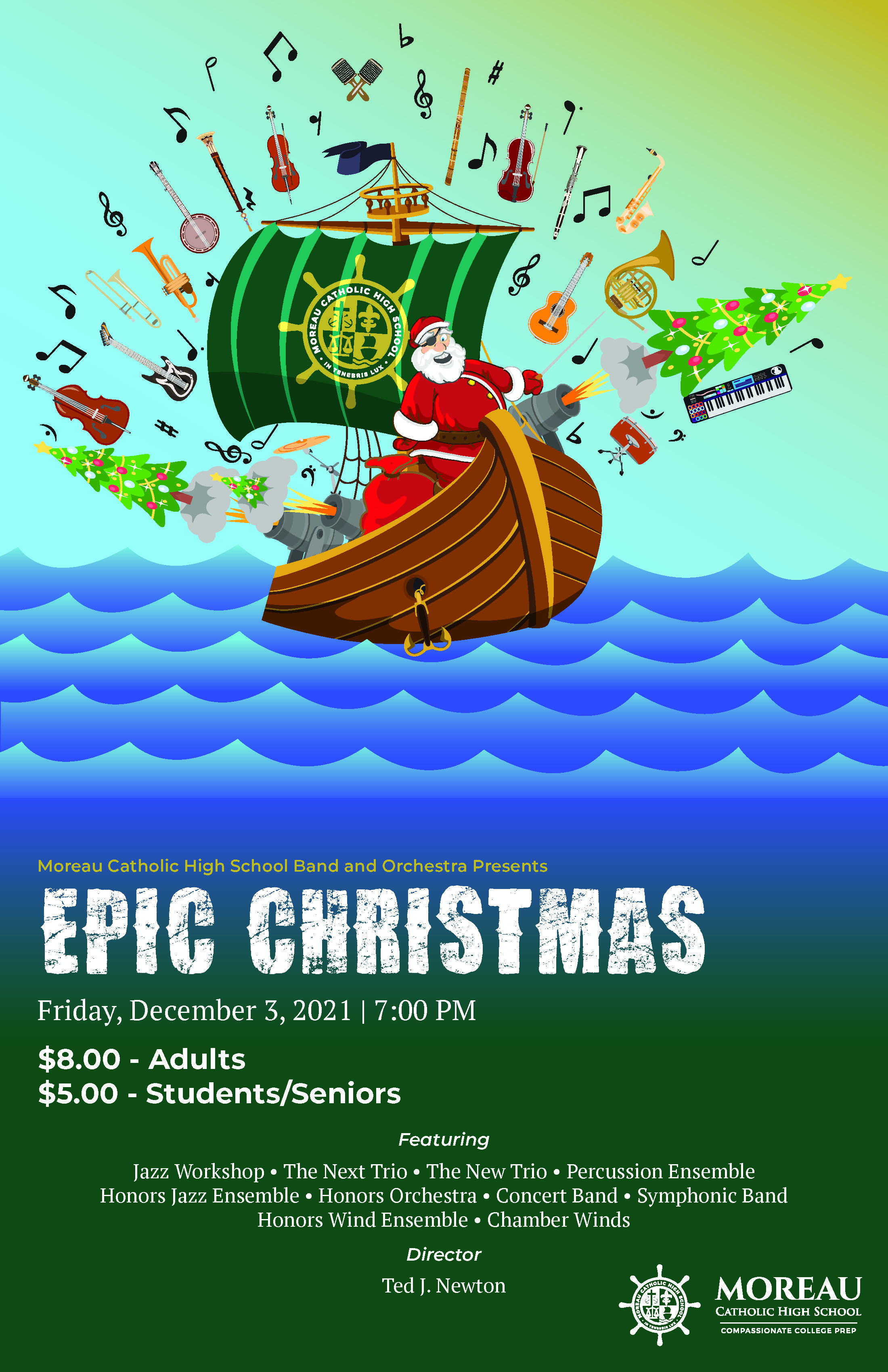
Epic Christmas
Band and Orchestra Winter ConcertVisual and Performing Arts
Adobe InDesign, Adobe Illustrator
Dec ’21
What screams Epic Christmas more than a pirate Santa Claus with an eye patch and a peg leg on a pirate ship with Christmas trees exploding from its cannons and a musical instrument background explosion? My first project at Moreau Catholic was an email from the Music Diector with only two words: Epic Christmas. My idea went straight to this as it ties the nautical theme with the school’s mascot, Mariners, but also plays to the “epic-ness” or wildness of theme of the concert: Epic Christmas.
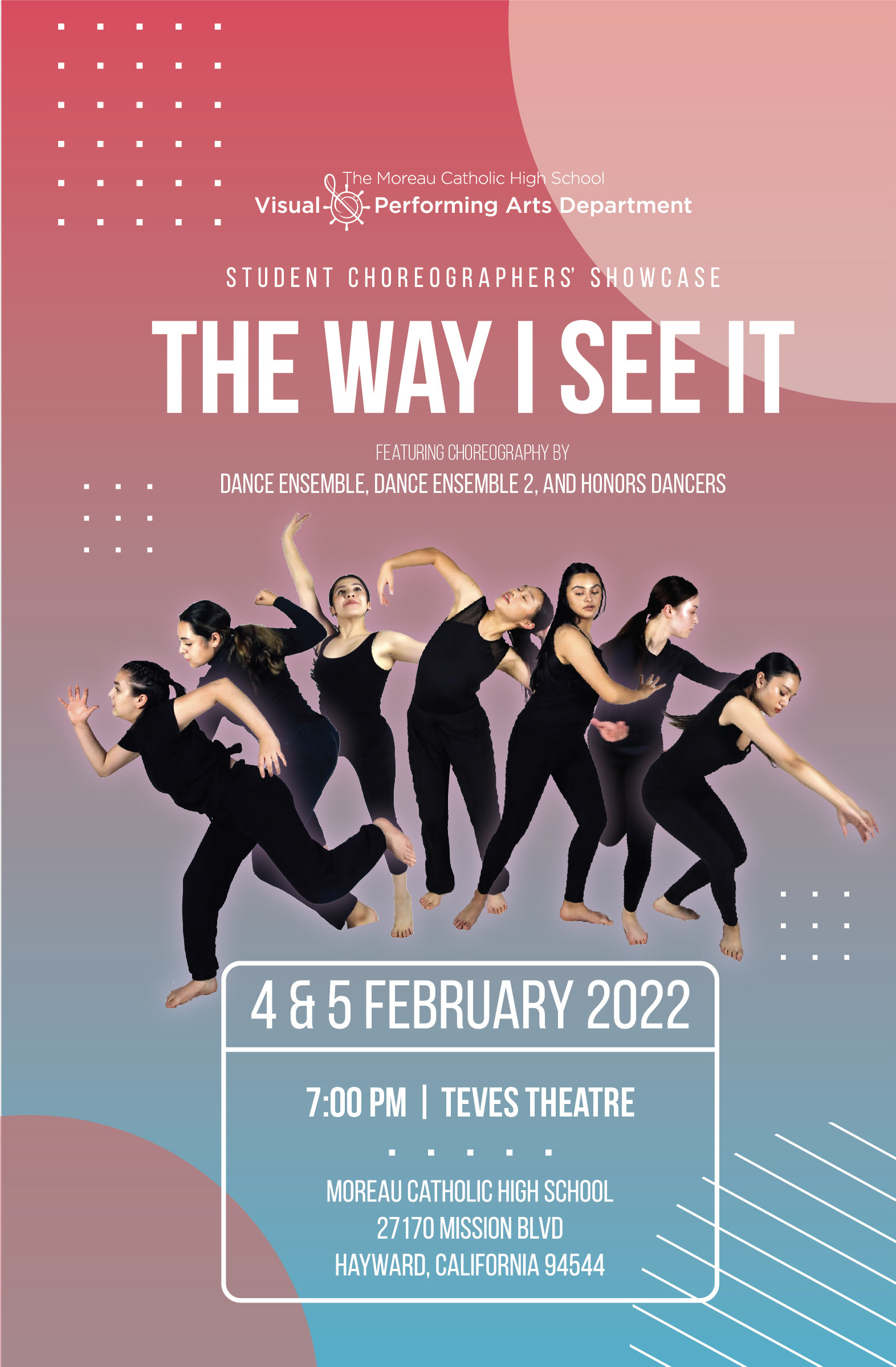
The Way I See It
Dance: Student Choreographers’ ShowcaseVisual and Performing Arts
Adobe InDesign, Adobe Photoshop, Adobe Illustrator
Feb ’22
The original poster design was created by a student, but it lacked the theme of dance. It portrayed a stylized eye to show “I see it” and the dancers would sit in random floating areas around the eye. From the original idea, I incorporated the color scheme and design elements into the background, but I wanted the student choreographers as the center of attention rather than a gigantic eye. I wanted the view to see the dancers as a movement of different styles of dance from left to right as if each dancer was the same person, but changed as they began to move. It’s as if a video of the dance was broken down into each frame and placed into the poster.
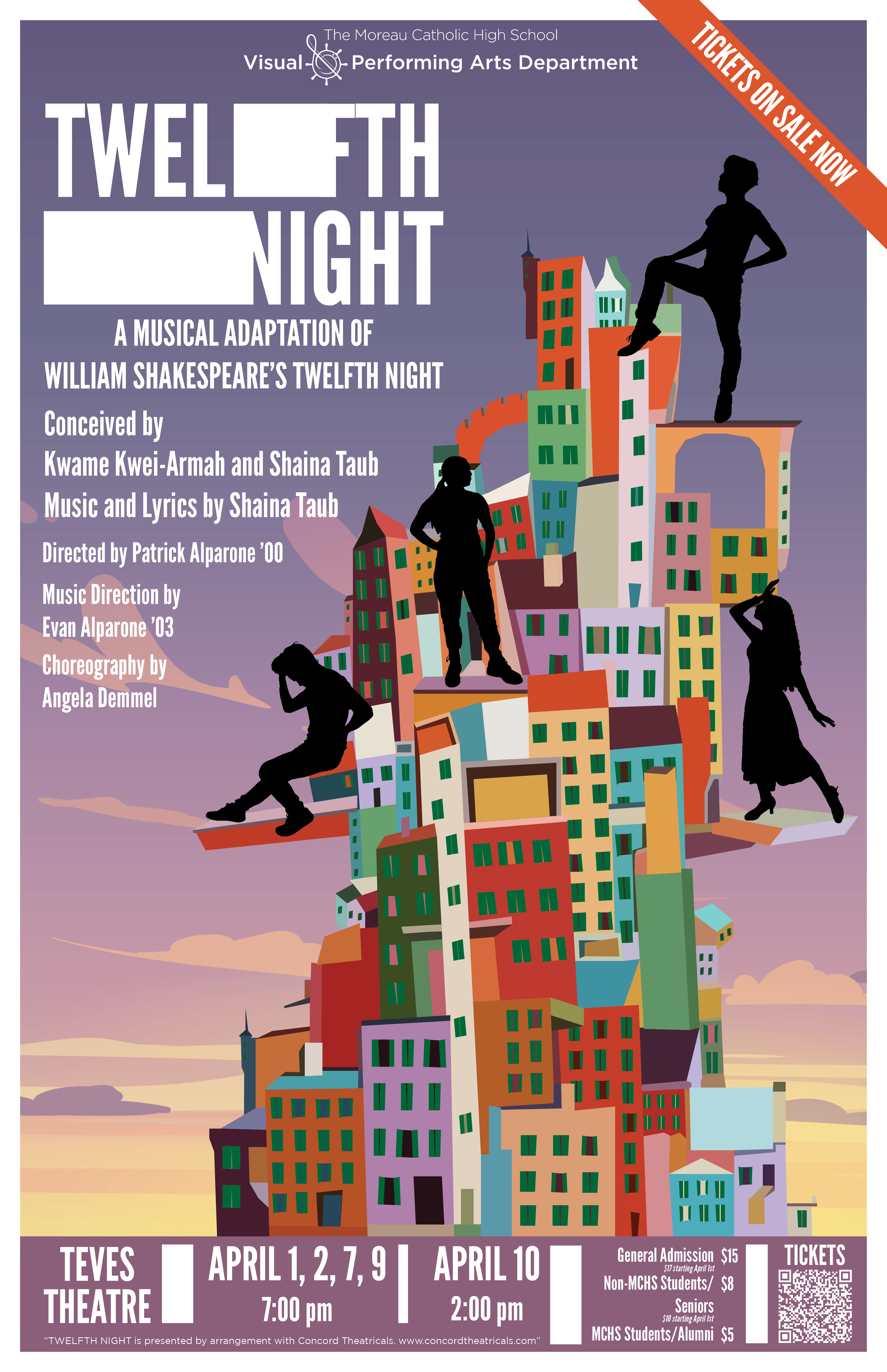
Twelfth Night
Theater Spring MusicalVisual and Performing Arts
Adobe Illustrator, Adobe InDesign
Apr ’22
The theme of Twelfth Night was inspired by the buildings in Italy’s Cinque Terre with its colorful pastel walls and the iconic green window shutters. The inspiration for the stacked buildings came from a piece by the artist, Ana Aragão to which I then drew in Illustrator. We (the Drama Director & I) staged the four primary student cast as how their characters are portrayed in the musical and silhouetted them into the poster.
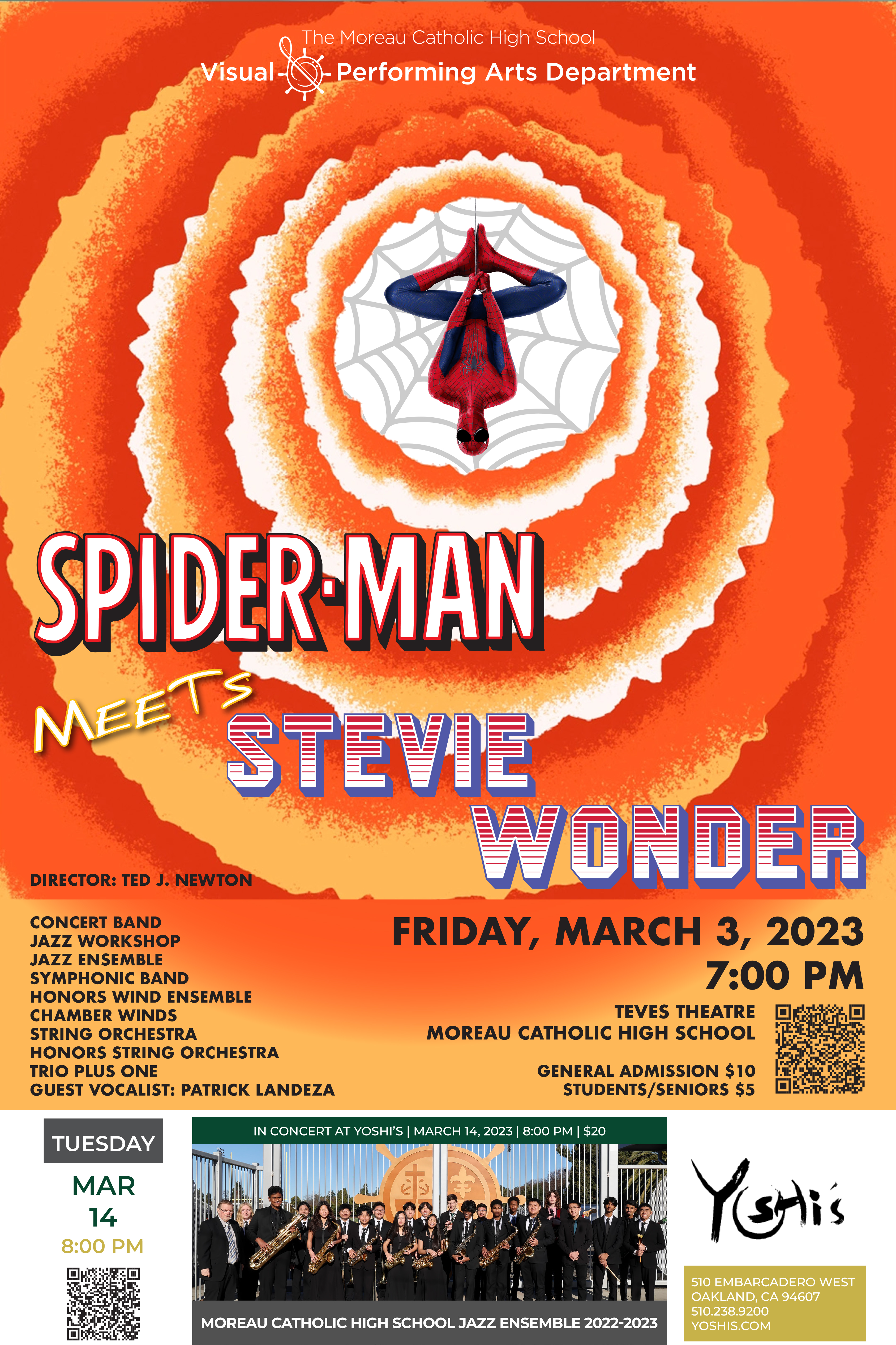
Spider-man Meets Stevie Wonder
Band and Orchestra Pops ConcertVisual and Performing Arts
Adobe InDesign, Adobe Illustrator
Feb ’23
As you can probably tell, the Music Director let’s my creativity go wild in each of the band and orchestra concerts. This is when I have the most creativity and the most fun, because there are no limits or client-side demands other than the title. Whatever I design, goes, and there is never any talk of “I want it to look like this” or “this doesn’t look good so do it again.” Instead, he always says, “I look forward to what you come up with.” This design is based off of Stevie Wonder’s album, Songs in the Key of Life paired with an upside-down Spider-man with sunglasses. There are so many versions of Spider-man titles so I’m unsure which one I based my title off of, but “Meets” is the Spider-man Homecoming font and “Stevie Wonder” is the same font as in the Higher Ground album cover.
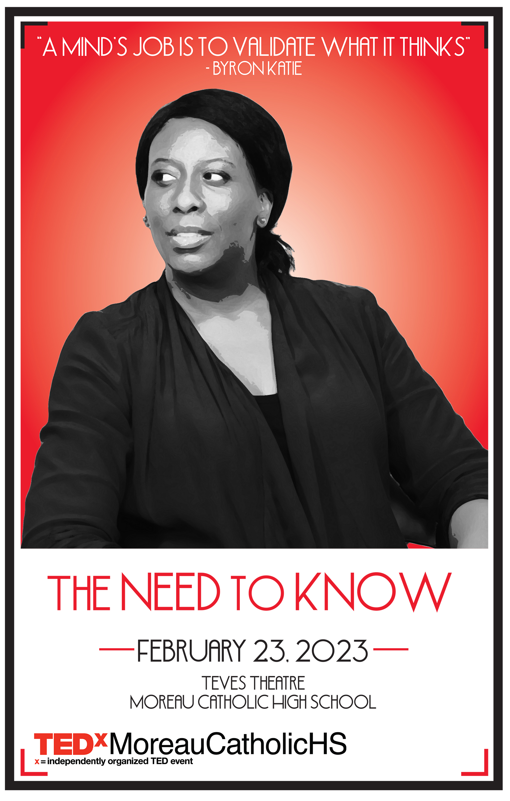
TEDxMoreauCatholicHS: The Need to Know
Social JusticeTheology
Adobe Illustrator, Adobe Photoshop, Adobe Indesign
Feb ’23
As you can probably tell, the Music Director let’s my creativity go wild in each of the band and orchestra concerts. This is when I have the most creativity and the most fun, because there are no limits or client-side demands other than the title. Whatever I design, goes, and there is never any talk of “I want it to look like this” or “this doesn’t look good so do it again.” Instead, he always says, “I look forward to what you come up with.” This design is based off of Stevie Wonder’s album, Songs in the Key of Life paired with an upside-down Spider-man with sunglasses. There are so many versions of Spider-man titles so I’m unsure which one I based my title off of, but “Meets” is the Spider-man Homecoming font and “Stevie Wonder” is the same font as in the Higher Ground album cover.
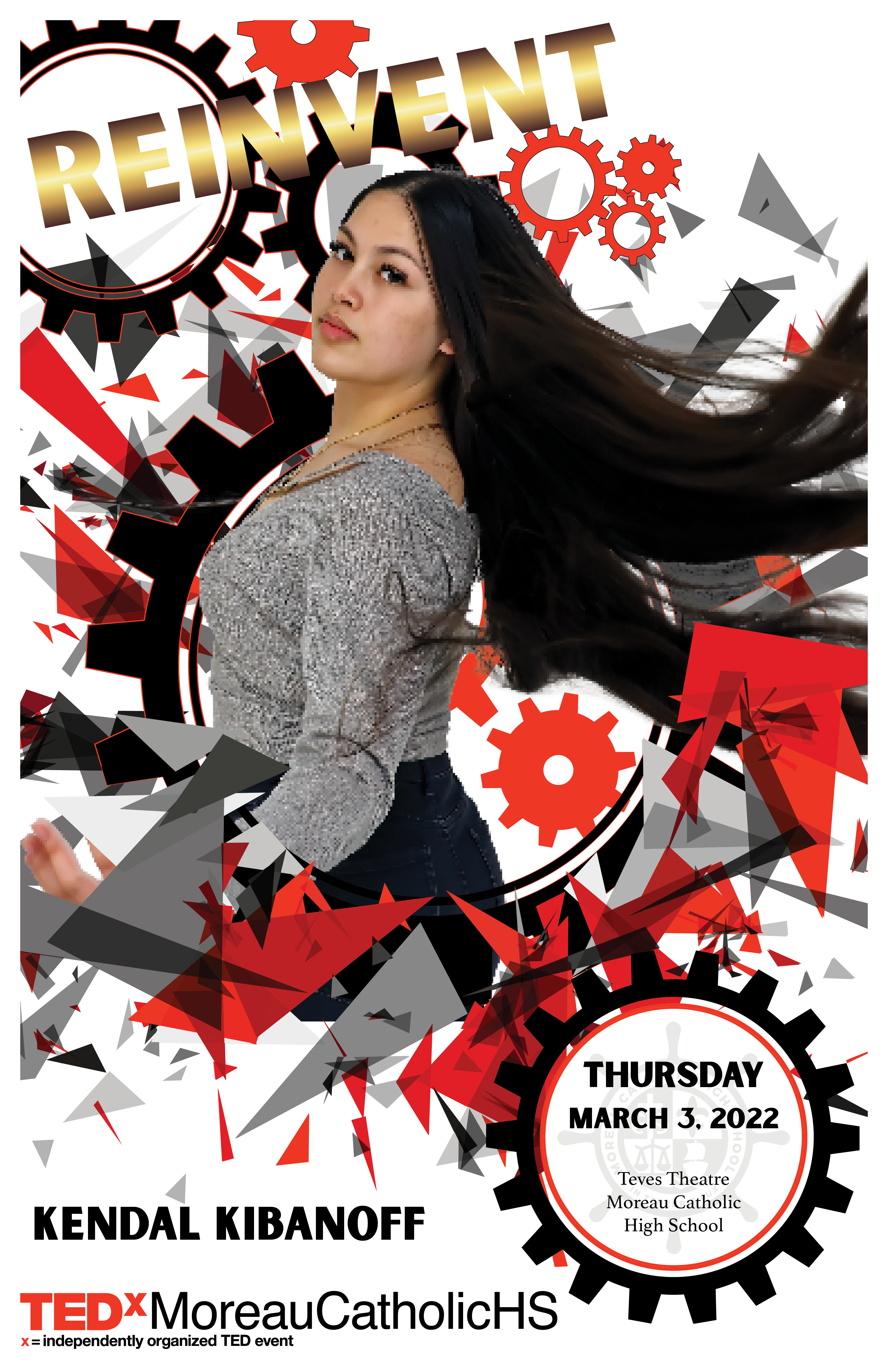
TEDxMoreauCatholicHS: Reinvent
Social JusticeTheology
Adobe Illustrator, Adobe Photoshop, Adobe Indesign
Mar ’22
As you can probably tell, the Music Director let’s my creativity go wild in each of the band and orchestra concerts. This is when I have the most creativity and the most fun, because there are no limits or client-side demands other than the title. Whatever I design, goes, and there is never any talk of “I want it to look like this” or “this doesn’t look good so do it again.” Instead, he always says, “I look forward to what you come up with.” This design is based off of Stevie Wonder’s album, Songs in the Key of Life paired with an upside-down Spider-man with sunglasses. There are so many versions of Spider-man titles so I’m unsure which one I based my title off of, but “Meets” is the Spider-man Homecoming font and “Stevie Wonder” is the same font as in the Higher Ground album cover.
Crab Feed Logo
Advancement/AthleticsAdobe Illustrator, Adobe After Effectd
Jan ’23
Nothing says crab feed than if it’s in your face, in all caps and there’s a red crab. I looked at previous designs of the annual crab feed and every crab was either green or gold, which are school colors, but didn’t stand out as the center of attention. I wanted the crab to look like how it’s supposed to or at least how it looks after being boiled: red. I also wanted to brand the event with a common logo as this was an annual event. If every year has a different crab design, every year is a new crab feed event. My intention is to use this logo repeatedly for each year with minor design changes, say if there’s a poster or other collateral with the event. In terms of the animation, the crab is a simple rotate back and forth as it changes position from bottom to top. The reveal of the circles and text are created with two shape layers.
Mock Trial Logo
Mock Trial TeamAdobe Illustrator
Oct ’22
This is a redesign of an older logo. This was made to be similar with the brand. The scale is the same as Moreau Catholic’s icon wheel logo and the name of the school and mock trial name follow the same font, Montserrat, and the same circular path.
Social Justice Institute Logo
Summer ProgrammingSocial Justice/Admissions
Adobe Illustrator
Dec ’22
After creating the Mock Trial logo, I was pitched an idea to create another logo for the Social Justice Institute, a summer program for 6th to incoming 9th graders to prepare them through academic, social, and spiritual learning experiences. I took some time to search for what a social justice logo meant that would be inclusive for all. There’s the common fist raised in the air, but that could be too much of just Black Lives Matter. Then there was a bunch of images featuring the scale, but that was too much law and order or just justice without the social. I then turned back to where I first learned about social justice, and it was through Ignatian Solidarity, with the word “solidarity” being the key word to help me find my design. I chose to design a ring of eight people as if they had their arms joined together in solidarity. I originally was going to color each person based on race, but then there are too many races and colors that leaving even one out would counter the meaning of the logo. I, instead, alternated colored each person with MCHS colors. The eight people don’ symbolize any number, but rather, it is meant to look like the Moreau Catholic logo of the wheel.
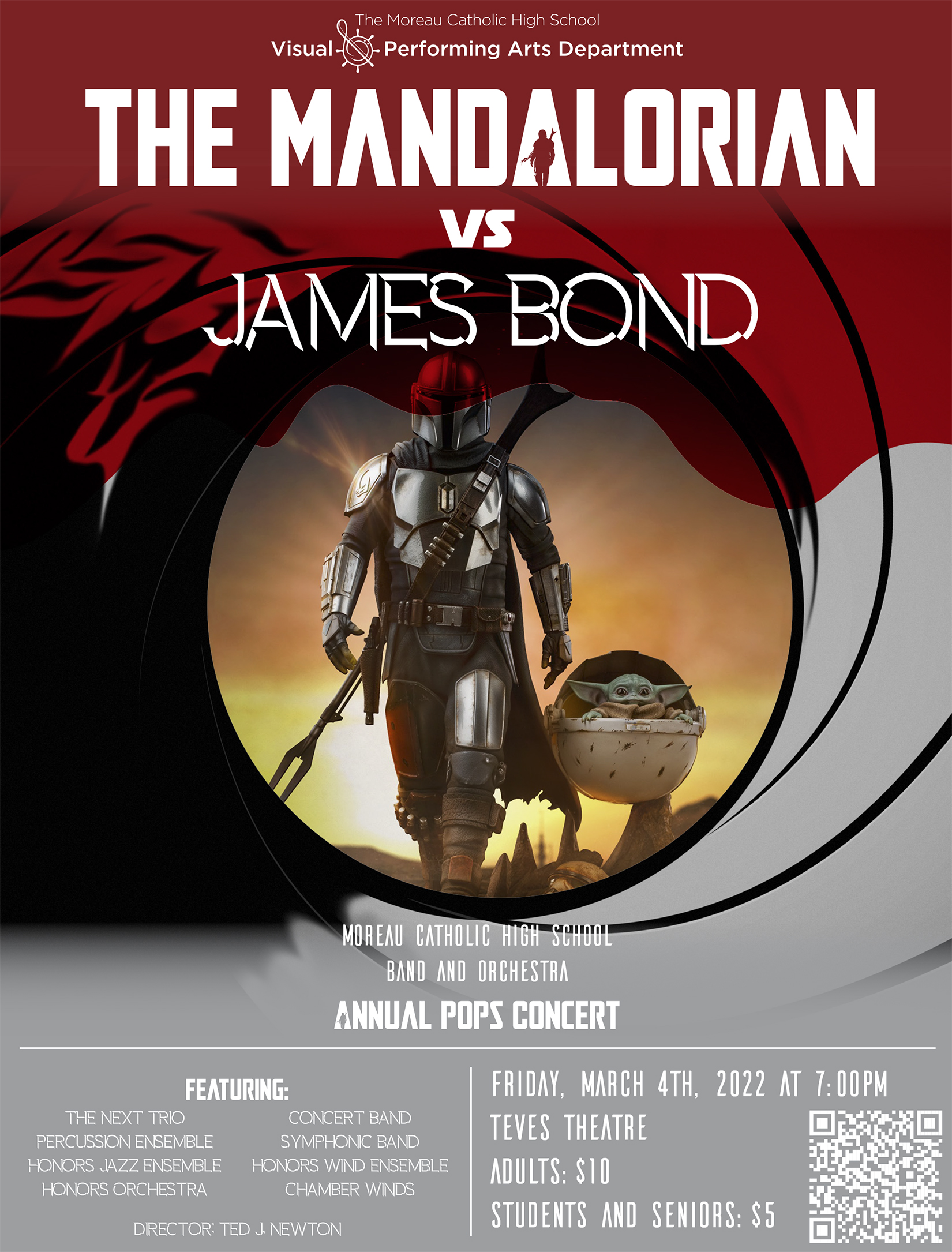
The Mandalorian vs James Bond
Band and Orchestra Pops ConcertVisual and Performing Arts
Adobe InDesign, Adobe Illustrator
Mar ’22
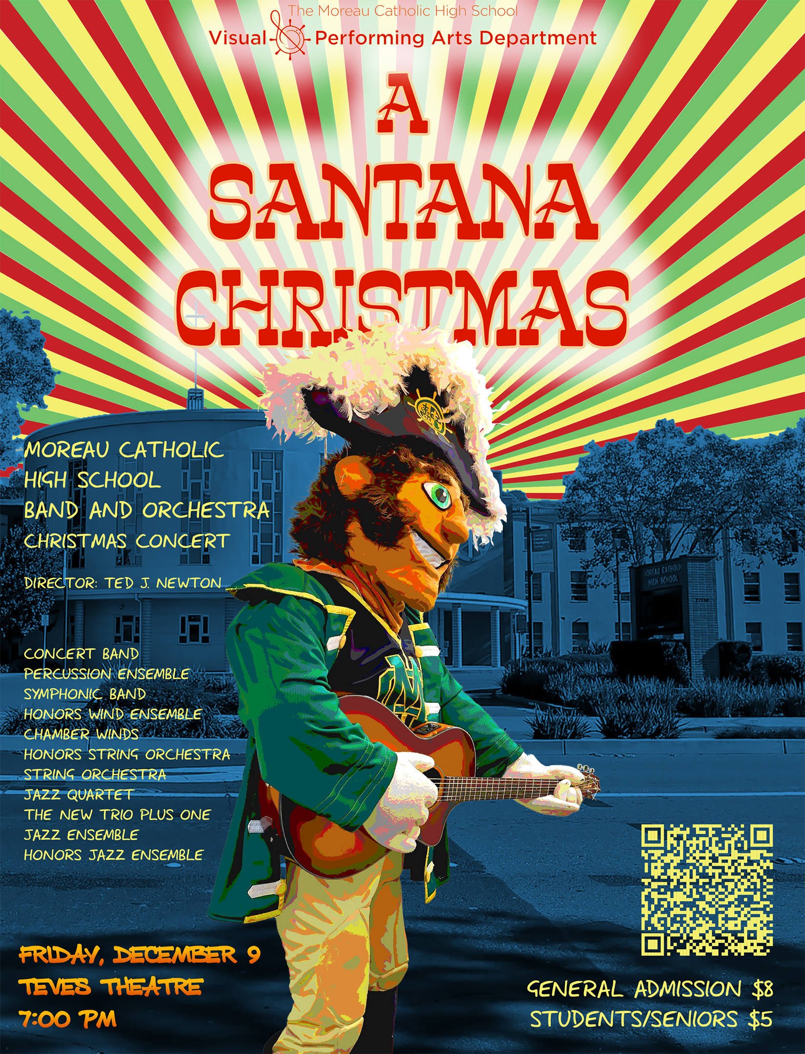
A Santana Christmas
Band and Orchestra Winter ConcertVisual and Performing Arts
Adobe InDesign, Adobe Illustrator, Adobe Photoshop
Dec ’22
This year’s theme for the Band and Orchestra Winter Concert was A Santana Christmas. I researched a bunch of Santana album covers and the one that stood out to me the most was Viva El Freedom. I used the same colors from the album as in the poster for the concert. The red, green, and yellow sun rays was created in Illustrator using a radial line pattern, then expanding it so I could isolate each line to the correct color order. I changed the blue town that’s in the album cover to the front of the school and added the blue overlay to it. Finally, in the album cover, Santana is in the center playing his guitar. Why not change it by adding Baz, the school mascot and position him with a guitar in a similar direction? I finalized Baz in Photoshop to add the hazy effect like the album cover.
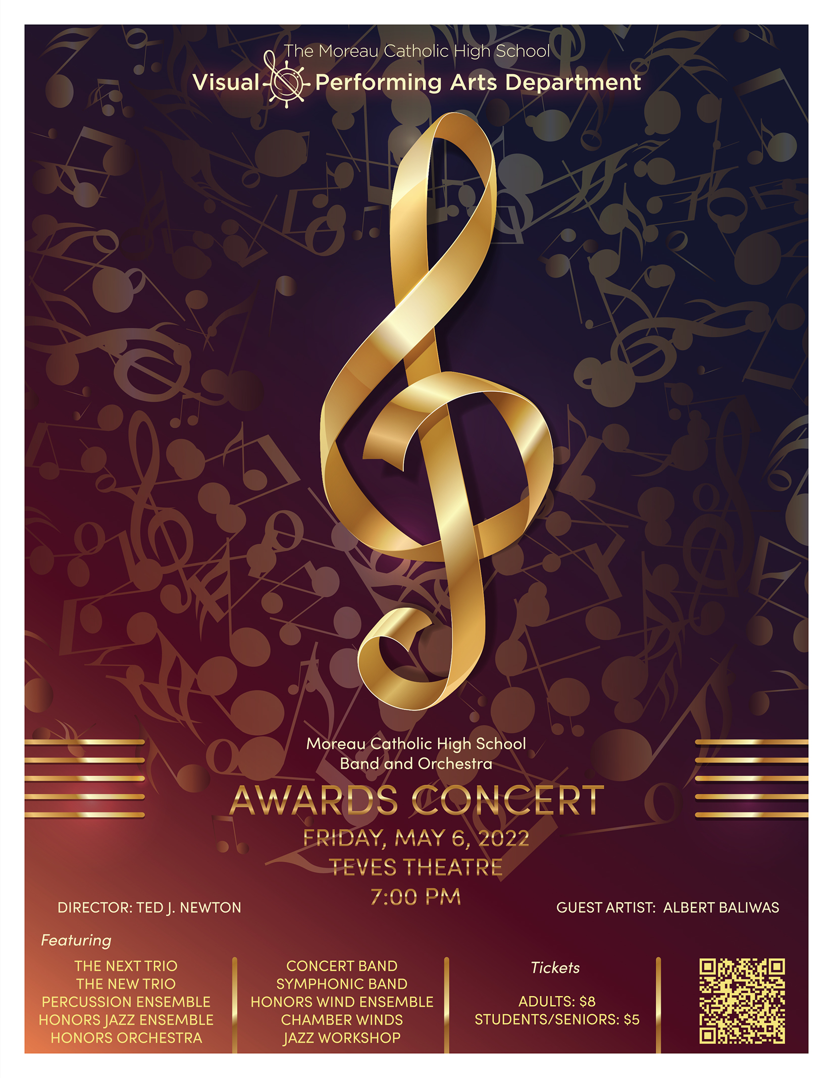
Band Awards
Band and Orchestra Pops ConcertVisual and Performing Arts
Adobe InDesign, Adobe Illustrator
May ’22
Out of all the Band and Orchestra poster designs, this one is the most regular and least creative out of all the others. It was more of a re-purposed design from a choir concert that I was going to use it for, but that design was rejected and it went a completely different direction. This design ended up working fo the show as I tried to make it look like a poster for the Oscars, being that it was an Awards Concert.